 This is a cartographic animation. It uses computer graphics to illustrate something that could not be possible with the traditional paper map. Another example of this would be looking at the movement of a hurricane track.
Monday, April 27, 2009
Cartographic Animation
This is a cartographic animation. It uses computer graphics to illustrate something that could not be possible with the traditional paper map. Another example of this would be looking at the movement of a hurricane track.
Unstandardized Choropleth Map
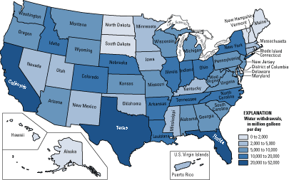 This is a unstandardized choropleth map of water withdrawals in each state across the U.S. This type of map uses unaveraged data sets.
Standardized Choropleth Map
 This map of Canada shows the percent of population of children under 14 year of age. The map is standardized and the data is represented via color shading. The different levels range from 11.9% to 36.7%. This map is a good way to show population growth, and the make-up of different areas of Canada.
Univariate Choropleth Map
 This is a univariate map of the U.S This is a univariate map, because it shows only one element of data, which value varies by a blue color scheme. The darker the blue, the higher level of the variable.
Bivariate Choropleth Map
 This bivariate choropleth map uses a color scheme with coordinates to show two different categories of information on one map of Africa. Each color on the map represents a different level of life expectancy, compared with GNP Per Capita. The countries with the lighter colors have the lowest levels of both categories, and the countries in black have the highest.
Unclassed Choropleth Map
 This is a map of infant mortality rates across Europe. Instead of statistical data to represent the values, the unclassed choropleth uses a valued color scheme.
Nominal Area Choropleth Map
 This map shows data of minority groups across the U.S on a nominal level. There is no concrete, statistical data given, we just know the minority that is most prevalent in each state.
Sunday, April 26, 2009
Lorenz Curve
 This is an example of the Lorenz Curve. It shows income distribution in a way that highlights economic inequality As the graph illustrates, the middle class has a disproportionate amount of the overall wealth.
Index Value Plot
 Index Value Plots are used to show the performance of a stock over a period of time. As you can see, the ATR % correlates somewhat with the performance of the Nifty Close stock.
Scatterplot
 This scatterpot shows the percentage of military recruits compared to the general population. This graph shows a positive correlation, with a fairly significant trend line.
Population Profile
 This is a projected population profile of people with, and without AIDS in Botswana, in the year 2020. This map shows some very troubling data. It appears that over half of the babies born in the country will have AIDS, and the percentages get worse as age 20 approaches. By the time the people of Botswana approach 80, they will almost certainly have AIDS.
Climograph
 This climograph shows the monthly precipitation and temperature conditions. The Precipitation is shown by the bar graph, and a line graph shows the temperature. The graph tells us that precipitation have somewhat of an inverse relationship in this area.
Windrose
 This is a windrose of Springfield, Missouri taken in the month of January over a 34 year span. the map shows that most of the wind blows to the southeast, and most of the wind blowing in every direction blows between 5-12 kts.
Triangular Plot
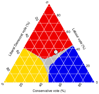 This is a triangular plot of an estimated voting outcomes in England. This style of graph is capable of pitting three different variables against each-other. This graph shows data that adds up to a number above 100%, meaning that there must be some voters who fit under multiple categories.
Tuesday, April 21, 2009
Parallel Coordinate Graph
 Parallel coordinate graphs are able to show large multivariate data sets. This style of graph is able to show correlation by observing the different color's line trends.
Histogram
 This histogram shows the scores for essays in a SAT challenge. As many standardized tests wish for, this graph shows a pretty good distribution of scores. The most common score was a 3, and a very low percentage of of people received either a 0 or a 6.
Box Plot
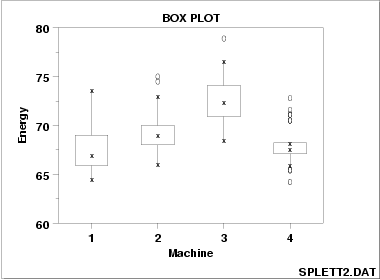 This is a box plot which is compare the energy outputs of four different machines. The larger the box, the larger the variability of the machine. Therefore, Machine 3 has the highest energy output, but a wide range of variability
Stem and Leaf Plot
 This stem and leaf plot of student's arm spans is measured in centimeters. From the plot we can conclude that the student's arm spans range from 130 cm, to 172 cm. However, nearly half of the students fall between the range of 147 cm and 153 cm.
Similarity Matrix
 A similarity matrix is a lot like a correlation matrix, but it uses colors to show a relationship rather than numbers. The dark red colors indicate high similarity between elements, and the squares with no color have no correlation.
Correlation Matrix
 This is an example of a correlation matrix. A correlation matrix is used to compare a set of variables to see how much they relate to each-other. This map can be used to chart out a wide range of things related, and unrelated to the cartography realm.
Star Plot
 This star plot of different makes of cars is capable of telling us a lot of information in a small amount of space. The more a plot reaches towards the labeled number, the higher the value of that variable. The key for each of the nine variables is listed below. For example, we can see that the AMC Spirit is low on nearly all nine variables.
 | 1 | Price |
| 2 | Mileage (MPG) |
| 3 | 1978 Repair Record (1 = Worst, 5 = Best) |
| 4 | 1977 Repair Record (1 = Worst, 5 = Best) |
| 5 | Headroom |
| 6 | Rear Seat Room |
| 7 | Trunk Space |
| 8 | Weight |
| 9 | Length |
Classed Choropleth Map
 This is a classed choropleth map showing the ratio of men to women by state. This map has four classes, with the darker colors representing a higher ratio of men. From this map we can see that Alaska and Nevada have the highest ratio of men in the U.S. A classed choropleth map is good to use when your variable range is not that large.
DOQQ
 This is a DOQQ, which is a computer-generated image of an ariel photograph. This black-and-white DOQQ was taken of Minneapolis, Minnesota. It shows a large area of the city with great resolution.
DEM
 This is a DEM (Digital Elevation Model) taken of Crater Lake in Oregon. DEM's are a great tool to display elevation differences because the use color contrasts, as well as a 3-dimensional model. From looking at this map, you can get a clear sense of the ruggedness of the terrain.
DLG
DRG
 This is a DRG of Eastford, Connecticut. DRG stands for Digital Raster Graphic, and it is a scanned image of a USGS standard series topographic map. These maps tend to have a very high resolution.
Monday, April 20, 2009
Isopleth
 This isopleth shows chloride ion wet disposition across the U.S. Isopleths commonly show how a chemical property varies across a landscape. The Southeast and Eastern Coast appears to have the highest levels of chloride ion wet disposition, along with a small area in the upper Northwest. All other areas in the continental U.S have extremely low levels of the chemical.
Isotachs
 This map with isotachs shows a severe wind pattern in the Great Plains area. The wind is moving at at northeastern direction and is a typical indicator of a cold front and thunderstorms.
Isohyets
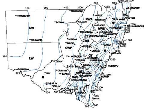
Isohyets are lines on a map that show amounts of rainfall. This maps isohyets show average annual rainfall for stations with more than 20 years of records in Sydney. This map shows a higher amount of rainfall in the eastern portion of the map, with the absolute most rainfall occurring on the coast.
Isopach
 This is an isopach map of the Upper Devonian in the eastern US. From viewing this map, you can see that the sediment is thicker in the east, and becomes finer as you more westward.
Isobar
 This weather map of Europe and the Mediterranean is a good example of isobars. It shows the barometric pressure of the area in hectopascals (hPa). A high pressure zone has a barometric pressure over 1015 hPa, so it seems that the center of the map is the region with the highest pressure.
LIDAR
 This is a terrestrial LIDAR scan of an eroding stream bank near Tahoe City, California. The water in the image is shown in black, and if you look carefully, you can see a tree that has fallen across the creek. LIDAR provides a fascinating looking image that is helpful when a target is far away.
Doppler Radar
 This is a Doppler radar image of Hurricane Katrina. This image shows just how massive the weather system was. The different shades of colors also shows Katrina's wide range of intensity levels.
Black and White Aerial Photo
 This black and white ariel photo was taken in Kansas City, and shows interstate 70 and 35. This picture was taken for artistic purposes, rather than to be used as a map. The interesting shapes and light contrasts makes the shot visually appealing.
Infrared Aerial Photo
Syaucuse This is an infrared aerial photo of Onondago Lake in the Syracuse area of New York. Photos like this one provide a unique perspective on a landscape. Many of these pictures are highly detailed and can be valuable mapping tools.
This is an infrared aerial photo of Onondago Lake in the Syracuse area of New York. Photos like this one provide a unique perspective on a landscape. Many of these pictures are highly detailed and can be valuable mapping tools.
Statistical Map
 I found this map to be particularly relevant considering our current economic status. It shows the statistical changes in median household income across U.S states. Unfortunately, only Wyoming, North Dakota, and Montana have seen a growth in household income over the last few years. Also, not surprisingly, Michigan has experienced the worst decrease.
Cartogram
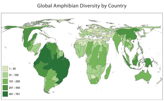 This is a cartogram of the world's amphibian diversity. Clearly, this does not resemble most traditional maps of the world. Regions which contain large numbers of amphibian species are illustrated as more pronounced, while areas with low numbers are virtually non-existent. As I would have expected, the rain forest makes South America the most important area on this map.
Friday, April 17, 2009
Flow Map
 This is a flow map of trucking routes based out of the state of Texas. I found this map to be extremely effective in getting its message across. From just a quick glance, I can tell where the bulk of Texas's hull is distributed to, and how vast Texas trucking is. The vein, or tributary like design also shows detailed information about where these trucks are going, without overcrowding the map space.
Isoline Map
 Isoline maps are maps that show 3 dimensions on a 2 dimensional plane. They do this by drawing circles within circles, which show differing levels of altitude. This example of a Isoline map shows all of the isolines drawn at intervals of 10 units apart.
Wednesday, April 15, 2009
Proportional Circle Map

This is a proportional circle map showing the Mexican population in the western U.S in 1990. This particular map is a continuous-variable proportional circle map, meaning that there is all different sizes of circles. This differs from a range-graded proportional circle map that has only a set number of circle sizes. The map shows that Texas and California has an overwhelming percentage of the western U.S's Mexican population.
Tuesday, April 14, 2009
Choropleth Map
 This is a Choropleth map that shows ratio map data. The map scale tells us that the darker shades of green represent a higher percentage of Hispanic or Latino population across the state of Florida. The trend of the map seems to be that the northern part of Florida has a low percentage of Hispanic and Latino population compared to the southern part.
Dot Distribution Map
 This dot distribution map shows population densities across the U.S. The U.S. land area is shown in black, with the white dots representing areas of high population. The map was designed to give the appearance that the people are lights visible during the night sky.
Propaganda Map
 This is a map of voting turnouts in the 2000 presidential election. By separating the U.S into counties, it appears that President Bush won the election overwhelmingly. However, we all know the election was much closer than the map makes it appear.
Hypsometric Map
 This is a Hypsometric map of the state of Maryland. The different shades on the map tell us how the altitude differs across the state. Maryland appears to increase in altitude from southeast to northwest. The state has a wide range in altitude which goes as low as below 50 feet, and as high as over 3,000 feet.
PLSS Map
 This is a PLSS map of Alabama. The state is divided into sections which represent all of Alabama's townships. This blue section in the northwestern portion of the state is Franklin County.
Cadastral Map
 This is a a digital cadastral map of Iranian land use. This particular map is of Namakabrood, which is a tourist village in the Mazandaran province. The use of these types of maps to show land ownership is somewhat of a new practice in Iran.
Thematic Map
n This map of soil moisture regimens shows some interesting information. The eastern half of the United States is almost entirely Udic with some splashes of Aquic. The soil regimens in the western portion of the contingent U.S is a swirl of 8 or 9 different soil types, and not one type really dominates. This shows that the soil regimen in the western U.S is much more diverse than the eastern U.S.
This map of soil moisture regimens shows some interesting information. The eastern half of the United States is almost entirely Udic with some splashes of Aquic. The soil regimens in the western portion of the contingent U.S is a swirl of 8 or 9 different soil types, and not one type really dominates. This shows that the soil regimen in the western U.S is much more diverse than the eastern U.S.
Topographic Map
 This is a topographic map of Brazil. It shows the differences in altitudes throughout the South American country. The map allows us to see the the northwestern portion of Brazil is rather flat, whereas the southeastern portion is rugged and mountainous.
Planimetric Map

This is a Planimetric map. Planimetric maps are digital, graphic maps that portray the horizontal position of planimetric features using lines and symbols. Planimetric maps are used for preliminary design of transportation projects. This example of a Planimetric map shows the layout of in area in bright neon colors.
Tuesday, January 20, 2009
Mental Map
 This is someone's mental map of Coal City, Illinois in the 1940's. A mental map displays someone's mental and personal point of view. As you can see from this example of a mental map, they can be quite detailed and provide a unique perspective of an area.
Subscribe to:
Posts (Atom)