 This is a cartographic animation. It uses computer graphics to illustrate something that could not be possible with the traditional paper map. Another example of this would be looking at the movement of a hurricane track.
Monday, April 27, 2009
Cartographic Animation
This is a cartographic animation. It uses computer graphics to illustrate something that could not be possible with the traditional paper map. Another example of this would be looking at the movement of a hurricane track.
Unstandardized Choropleth Map
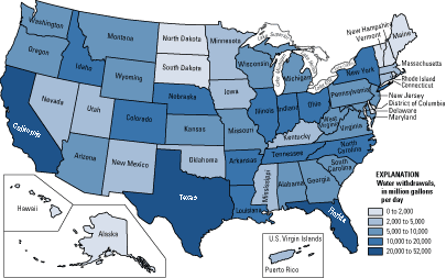 This is a unstandardized choropleth map of water withdrawals in each state across the U.S. This type of map uses unaveraged data sets.
Standardized Choropleth Map
 This map of Canada shows the percent of population of children under 14 year of age. The map is standardized and the data is represented via color shading. The different levels range from 11.9% to 36.7%. This map is a good way to show population growth, and the make-up of different areas of Canada.
Univariate Choropleth Map
 This is a univariate map of the U.S This is a univariate map, because it shows only one element of data, which value varies by a blue color scheme. The darker the blue, the higher level of the variable.
Bivariate Choropleth Map
 This bivariate choropleth map uses a color scheme with coordinates to show two different categories of information on one map of Africa. Each color on the map represents a different level of life expectancy, compared with GNP Per Capita. The countries with the lighter colors have the lowest levels of both categories, and the countries in black have the highest.
Unclassed Choropleth Map
 This is a map of infant mortality rates across Europe. Instead of statistical data to represent the values, the unclassed choropleth uses a valued color scheme.
Nominal Area Choropleth Map
 This map shows data of minority groups across the U.S on a nominal level. There is no concrete, statistical data given, we just know the minority that is most prevalent in each state.
Subscribe to:
Posts (Atom)