 This is an example of the Lorenz Curve. It shows income distribution in a way that highlights economic inequality As the graph illustrates, the middle class has a disproportionate amount of the overall wealth.
Sunday, April 26, 2009
Lorenz Curve
This is an example of the Lorenz Curve. It shows income distribution in a way that highlights economic inequality As the graph illustrates, the middle class has a disproportionate amount of the overall wealth.

Index Value Plot
 Index Value Plots are used to show the performance of a stock over a period of time. As you can see, the ATR % correlates somewhat with the performance of the Nifty Close stock.
Scatterplot
 This scatterpot shows the percentage of military recruits compared to the general population. This graph shows a positive correlation, with a fairly significant trend line.
Population Profile
 This is a projected population profile of people with, and without AIDS in Botswana, in the year 2020. This map shows some very troubling data. It appears that over half of the babies born in the country will have AIDS, and the percentages get worse as age 20 approaches. By the time the people of Botswana approach 80, they will almost certainly have AIDS.
Climograph
 This climograph shows the monthly precipitation and temperature conditions. The Precipitation is shown by the bar graph, and a line graph shows the temperature. The graph tells us that precipitation have somewhat of an inverse relationship in this area.
Windrose
 This is a windrose of Springfield, Missouri taken in the month of January over a 34 year span. the map shows that most of the wind blows to the southeast, and most of the wind blowing in every direction blows between 5-12 kts.
Triangular Plot
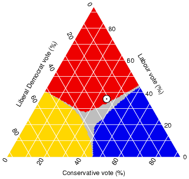 This is a triangular plot of an estimated voting outcomes in England. This style of graph is capable of pitting three different variables against each-other. This graph shows data that adds up to a number above 100%, meaning that there must be some voters who fit under multiple categories.
Subscribe to:
Posts (Atom)