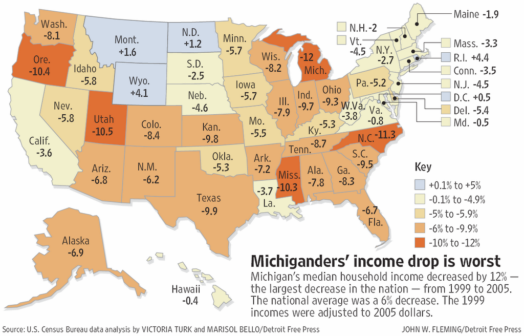
 I found this map to be particularly relevant considering our current economic status. It shows the statistical changes in median household income across U.S states. Unfortunately, only Wyoming, North Dakota, and Montana have seen a growth in household income over the last few years. Also, not surprisingly, Michigan has experienced the worst decrease.
Monday, April 20, 2009
Statistical Map
I found this map to be particularly relevant considering our current economic status. It shows the statistical changes in median household income across U.S states. Unfortunately, only Wyoming, North Dakota, and Montana have seen a growth in household income over the last few years. Also, not surprisingly, Michigan has experienced the worst decrease.

Cartogram
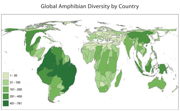 This is a cartogram of the world's amphibian diversity. Clearly, this does not resemble most traditional maps of the world. Regions which contain large numbers of amphibian species are illustrated as more pronounced, while areas with low numbers are virtually non-existent. As I would have expected, the rain forest makes South America the most important area on this map.
Friday, April 17, 2009
Flow Map
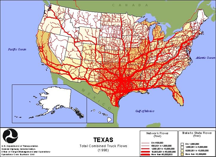 This is a flow map of trucking routes based out of the state of Texas. I found this map to be extremely effective in getting its message across. From just a quick glance, I can tell where the bulk of Texas's hull is distributed to, and how vast Texas trucking is. The vein, or tributary like design also shows detailed information about where these trucks are going, without overcrowding the map space.
Isoline Map
 Isoline maps are maps that show 3 dimensions on a 2 dimensional plane. They do this by drawing circles within circles, which show differing levels of altitude. This example of a Isoline map shows all of the isolines drawn at intervals of 10 units apart.
Wednesday, April 15, 2009
Proportional Circle Map

This is a proportional circle map showing the Mexican population in the western U.S in 1990. This particular map is a continuous-variable proportional circle map, meaning that there is all different sizes of circles. This differs from a range-graded proportional circle map that has only a set number of circle sizes. The map shows that Texas and California has an overwhelming percentage of the western U.S's Mexican population.
Tuesday, April 14, 2009
Choropleth Map
 This is a Choropleth map that shows ratio map data. The map scale tells us that the darker shades of green represent a higher percentage of Hispanic or Latino population across the state of Florida. The trend of the map seems to be that the northern part of Florida has a low percentage of Hispanic and Latino population compared to the southern part.
Dot Distribution Map
 This dot distribution map shows population densities across the U.S. The U.S. land area is shown in black, with the white dots representing areas of high population. The map was designed to give the appearance that the people are lights visible during the night sky.
Subscribe to:
Posts (Atom)