 This is a cartographic animation. It uses computer graphics to illustrate something that could not be possible with the traditional paper map. Another example of this would be looking at the movement of a hurricane track.
Monday, April 27, 2009
Cartographic Animation
This is a cartographic animation. It uses computer graphics to illustrate something that could not be possible with the traditional paper map. Another example of this would be looking at the movement of a hurricane track.

Unstandardized Choropleth Map
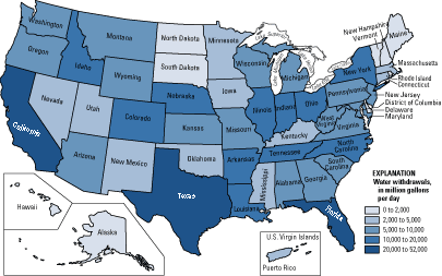 This is a unstandardized choropleth map of water withdrawals in each state across the U.S. This type of map uses unaveraged data sets.
Standardized Choropleth Map
 This map of Canada shows the percent of population of children under 14 year of age. The map is standardized and the data is represented via color shading. The different levels range from 11.9% to 36.7%. This map is a good way to show population growth, and the make-up of different areas of Canada.
Univariate Choropleth Map
 This is a univariate map of the U.S This is a univariate map, because it shows only one element of data, which value varies by a blue color scheme. The darker the blue, the higher level of the variable.
Bivariate Choropleth Map
 This bivariate choropleth map uses a color scheme with coordinates to show two different categories of information on one map of Africa. Each color on the map represents a different level of life expectancy, compared with GNP Per Capita. The countries with the lighter colors have the lowest levels of both categories, and the countries in black have the highest.
Unclassed Choropleth Map
 This is a map of infant mortality rates across Europe. Instead of statistical data to represent the values, the unclassed choropleth uses a valued color scheme.
Nominal Area Choropleth Map
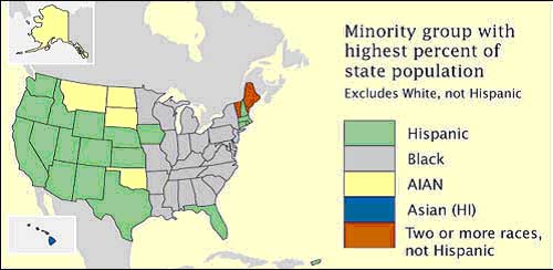 This map shows data of minority groups across the U.S on a nominal level. There is no concrete, statistical data given, we just know the minority that is most prevalent in each state.
Sunday, April 26, 2009
Lorenz Curve
 This is an example of the Lorenz Curve. It shows income distribution in a way that highlights economic inequality As the graph illustrates, the middle class has a disproportionate amount of the overall wealth.
Index Value Plot
 Index Value Plots are used to show the performance of a stock over a period of time. As you can see, the ATR % correlates somewhat with the performance of the Nifty Close stock.
Scatterplot
 This scatterpot shows the percentage of military recruits compared to the general population. This graph shows a positive correlation, with a fairly significant trend line.
Population Profile
 This is a projected population profile of people with, and without AIDS in Botswana, in the year 2020. This map shows some very troubling data. It appears that over half of the babies born in the country will have AIDS, and the percentages get worse as age 20 approaches. By the time the people of Botswana approach 80, they will almost certainly have AIDS.
Climograph
 This climograph shows the monthly precipitation and temperature conditions. The Precipitation is shown by the bar graph, and a line graph shows the temperature. The graph tells us that precipitation have somewhat of an inverse relationship in this area.
Windrose
 This is a windrose of Springfield, Missouri taken in the month of January over a 34 year span. the map shows that most of the wind blows to the southeast, and most of the wind blowing in every direction blows between 5-12 kts.
Triangular Plot
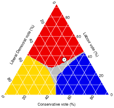 This is a triangular plot of an estimated voting outcomes in England. This style of graph is capable of pitting three different variables against each-other. This graph shows data that adds up to a number above 100%, meaning that there must be some voters who fit under multiple categories.
Tuesday, April 21, 2009
Parallel Coordinate Graph
 Parallel coordinate graphs are able to show large multivariate data sets. This style of graph is able to show correlation by observing the different color's line trends.
Histogram
 This histogram shows the scores for essays in a SAT challenge. As many standardized tests wish for, this graph shows a pretty good distribution of scores. The most common score was a 3, and a very low percentage of of people received either a 0 or a 6.
Box Plot
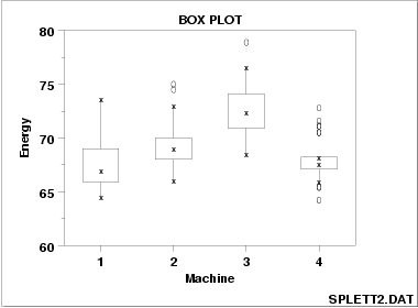 This is a box plot which is compare the energy outputs of four different machines. The larger the box, the larger the variability of the machine. Therefore, Machine 3 has the highest energy output, but a wide range of variability
Stem and Leaf Plot
 This stem and leaf plot of student's arm spans is measured in centimeters. From the plot we can conclude that the student's arm spans range from 130 cm, to 172 cm. However, nearly half of the students fall between the range of 147 cm and 153 cm.
Similarity Matrix
 A similarity matrix is a lot like a correlation matrix, but it uses colors to show a relationship rather than numbers. The dark red colors indicate high similarity between elements, and the squares with no color have no correlation.
Correlation Matrix
 This is an example of a correlation matrix. A correlation matrix is used to compare a set of variables to see how much they relate to each-other. This map can be used to chart out a wide range of things related, and unrelated to the cartography realm.
Subscribe to:
Posts (Atom)